How to use Google's Looker Studio to create custom analytics reports
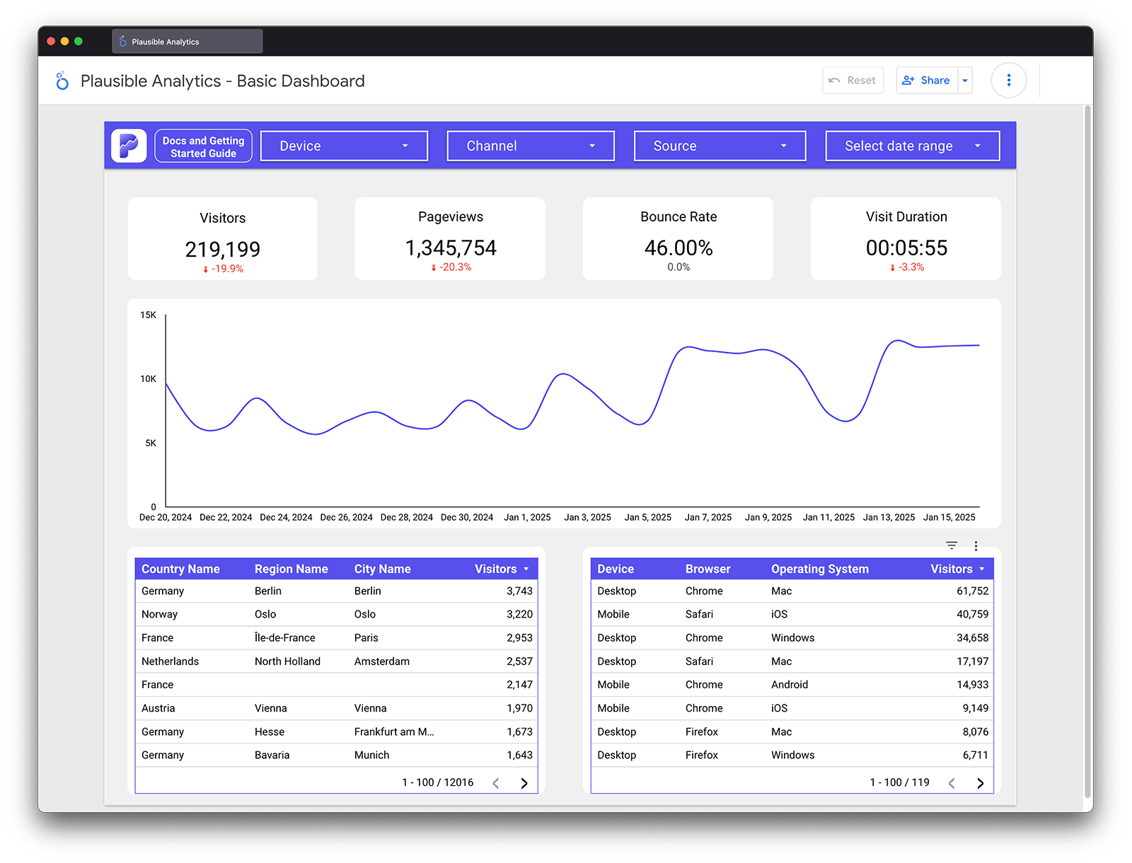
Plausible keeps its dashboard simple by design. But some workflows need more: custom layouts for clients, reports that blend traffic data with ad spend, or views that go beyond what a fixed dashboard can offer. That is what the official Plausible Analytics Looker Studio connector is for.
Looker Studio is Google’s free data visualization tool. This guide walks through its capabilities using the Plausible connector as the example, from basic visualizations to advanced techniques like data blending, calculated fields and conditional formatting.
- What is Looker Studio?
- How to use Looker Studio?
- Plausible Analytics connector for Looker Studio
- Creating a simple report in Looker Studio
- Advanced uses of Looker Studio
- Try it for yourself
What is Looker Studio?
Looker Studio is what was previously known as Google Data Studio. It is a data visualization tool designed with the intent of helping you create custom reports and simplify their interpretation through visualizations that you or your clients prefer.
It allows you to bring data from multiple sources into one place, transforming complex information into clear, easy-to-digest reports. This helps you get actionable and valuable insights from raw data.
Looker Studio is free of cost to use, as a self-service business intelligence tool. However, the Looker Studio Pro is also an option.
In a nutshell, you can do the following with Looker Studio:
- Use visuals like tables, pie charts, bar graphs, etc.
- Select the specific data and custom metrics you want to showcase.
- Customize fonts, colors, and overall design. Or even do something like incorporating your client’s logo for personalization.
- Share reports with others, giving them permission to either view or edit the reports based on your preferences.
The Looker Studio is not only limited to Google’s tools like Google Analytics 4, Google Ads, Google Sheets, etc., but also connects with various third-party tools that connect data and analytics that are useful to businesses. It could be a CRM, Meta Ads, LinkedIn Ads, product analytics, etc.
The reports can be dynamic, meaning they automatically update whenever the original data source changes, ensuring your reports automatically reflect the most current information.
How to use Looker Studio?
If you’re new to the Looker Studio, you can start by creating an account here. The dashboard offers a variety of templates, from simple data overviews to detailed analyses.
You can choose a template based on your needs and/or the audience of these visualizations. For eg., if you are a digital marketing team, you can look at the templates showcasing key KPIs like conversion rates, impressions by channel, and audience engagement.
But the more important part is choosing a data connector. This basically means which tool you want Looker Studio to source its data from, so that you can create custom reports from it.
As a crash course on how to use Looker Studio, we will take the example of our own connector.
Plausible Analytics connector for Looker Studio
Plausible Analytics is a simpler, privacy-friendly and more accurate alternative to Google Analytics. The official Plausible Looker Studio connector connects your Plausible data to Looker Studio so you can build custom reports and combine it with all your other data sources.
It makes Plausible an even stronger replacement for Google Analytics for teams that need custom reporting alongside privacy-first data collection.
Creating a simple report in Looker Studio
To create our first report in Looker Studio, we will create a simple replica of the default Plausible Analytics dashboard. This will give us a feel for what fields are available in the Looker Studio connector and how we can begin to create our own custom data visualizations.
You can explore this simple report template that we’ve created in Looker Studio which you can use to start building your own custom reports.
First, a brief overview of how Looker Studio works. On the right hand side, you will see a toolbar that gives you options of the different fields available while above that, you can see the different visualization options.
When you insert a visualization such as a time series chart, you will have the option to add fields as “Dimensions”, “Metrics” or “Filters”. You can also specify how you want the data sorted and apply some custom styling.
Let’s see this in action by recreating the top graph in the Plausible Analytics dashboard, which looks like this.
Time Series graph
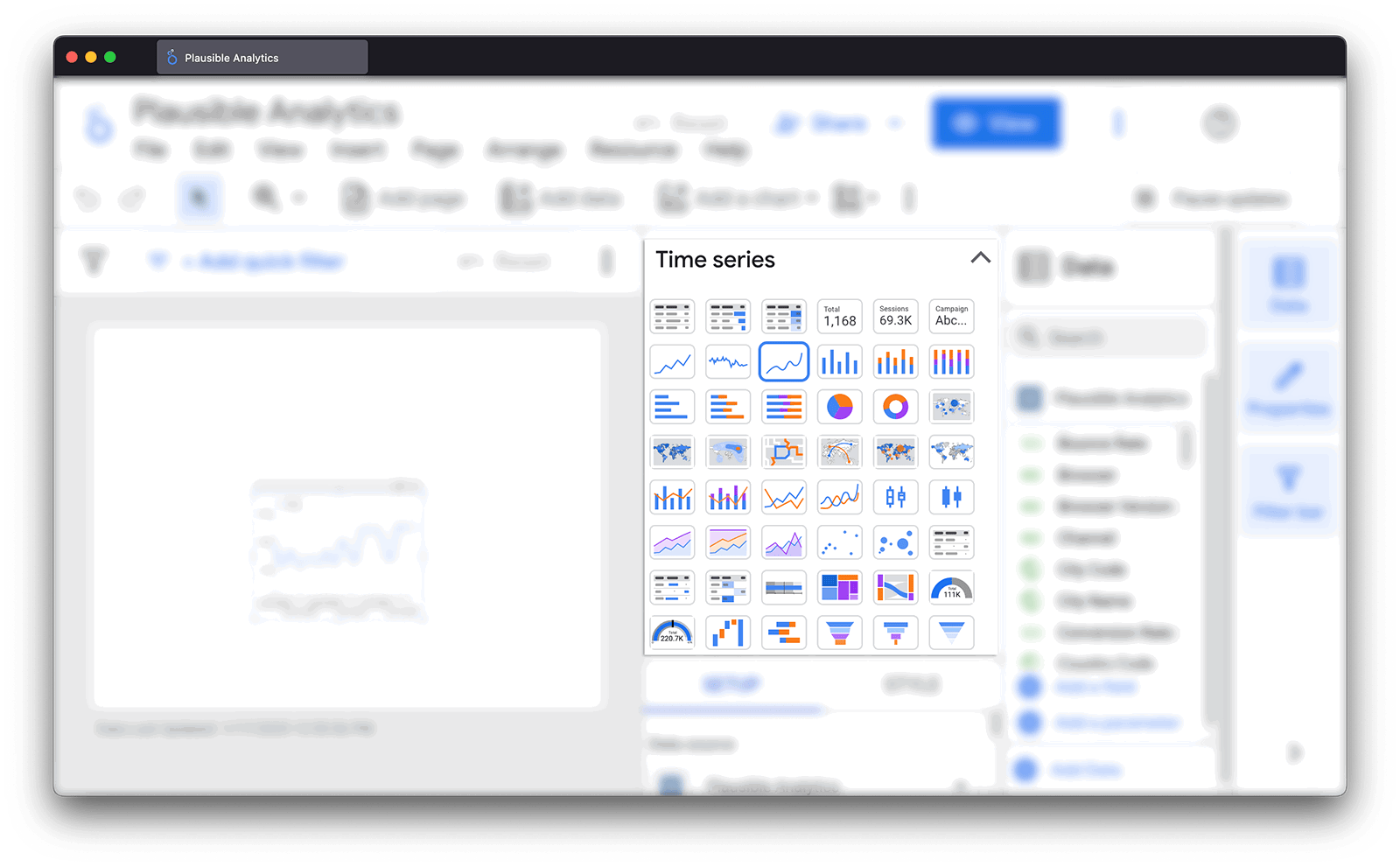
The most prominent part of the dashboard is the line chart that displays the number of “Unique Visitors” over time. In order to recreate this, we will select a “Time Series Chart” from the right-hand toolbar or you can do the same from the top menu under “Insert”.
Then, we will simply need to select “Date” as our dimension and “Visitors” as our metric.
Depending on what time range you want to use your chart for, you can set things up differently in Looker Studio. If you want to see daily or weekly numbers, you should use the “Date” dimension. For weekly, you can change the way that Looker Studio reads the “Date” field by clicking on the calendar icon and changing “Data Type” to “Date & Time > ISO Year Week”.
If you want to see annual or monthly data, you could either have Looker Studio do it for you by changing “Data Type” to “Date & Time > Year or Year Month”, or you could select “Year or Year Month” as your dimension instead of “Date” (both ways work the same).
Finally, if you want to see hourly data, you should use the “Time” dimension. Once we’ve configured our fields, we should have something that looks like this.
Scorecards
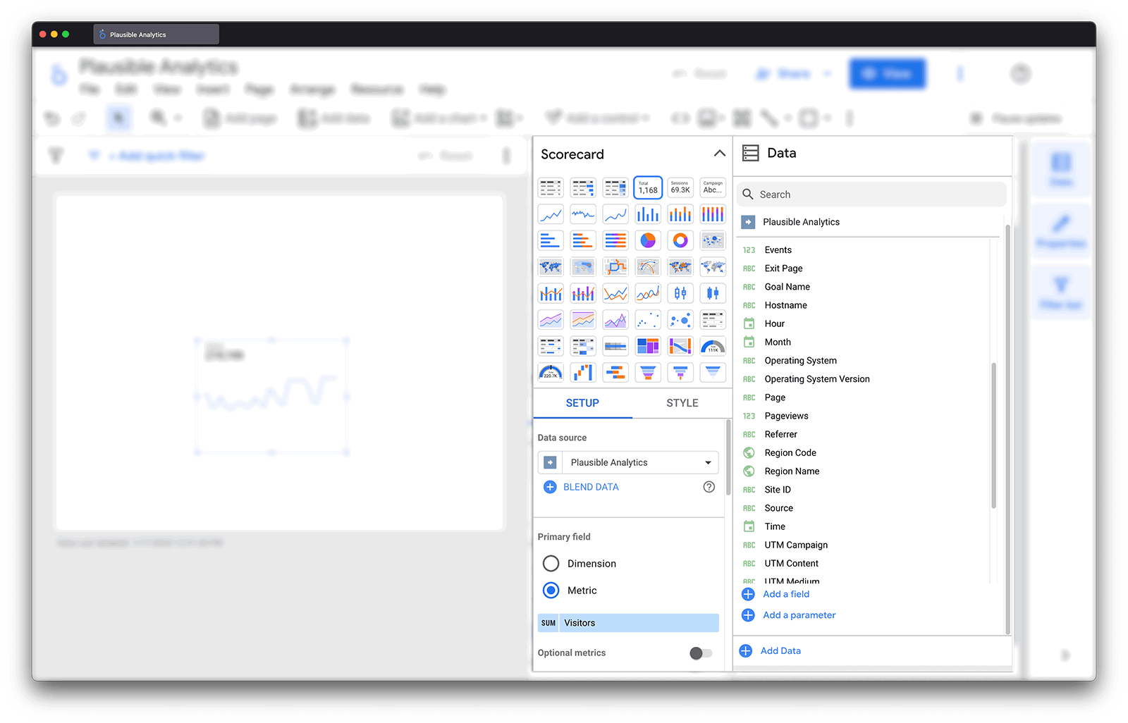
Going back to the Plausible dashboard as our guide, next we want to add the individual metrics across the top. In Looker Studio, these are called “Scorecards”. Let’s add one by going to “Insert” and choosing “Scorecard”.
The configuration for a scorecard is simple, you just need to pick the dimension that you want to highlight. Let’s start with “Visitors”, then we can simply copy and paste the scorecard and update the metric for visits, pageviews, views per visit, bounce rate and visit duration.
In order to add the comparison to the prior period, we can select “Comparison Date Range” and choose “Previous Period”. This tells Looker Studio to automatically calculate the change based on the date range you have selected so if you’re looking at the last 30 days, it will take data from the 30 days before that and tell you what the difference is.
Once we’ve set up all of our scorecards, we have something like this.
Date range
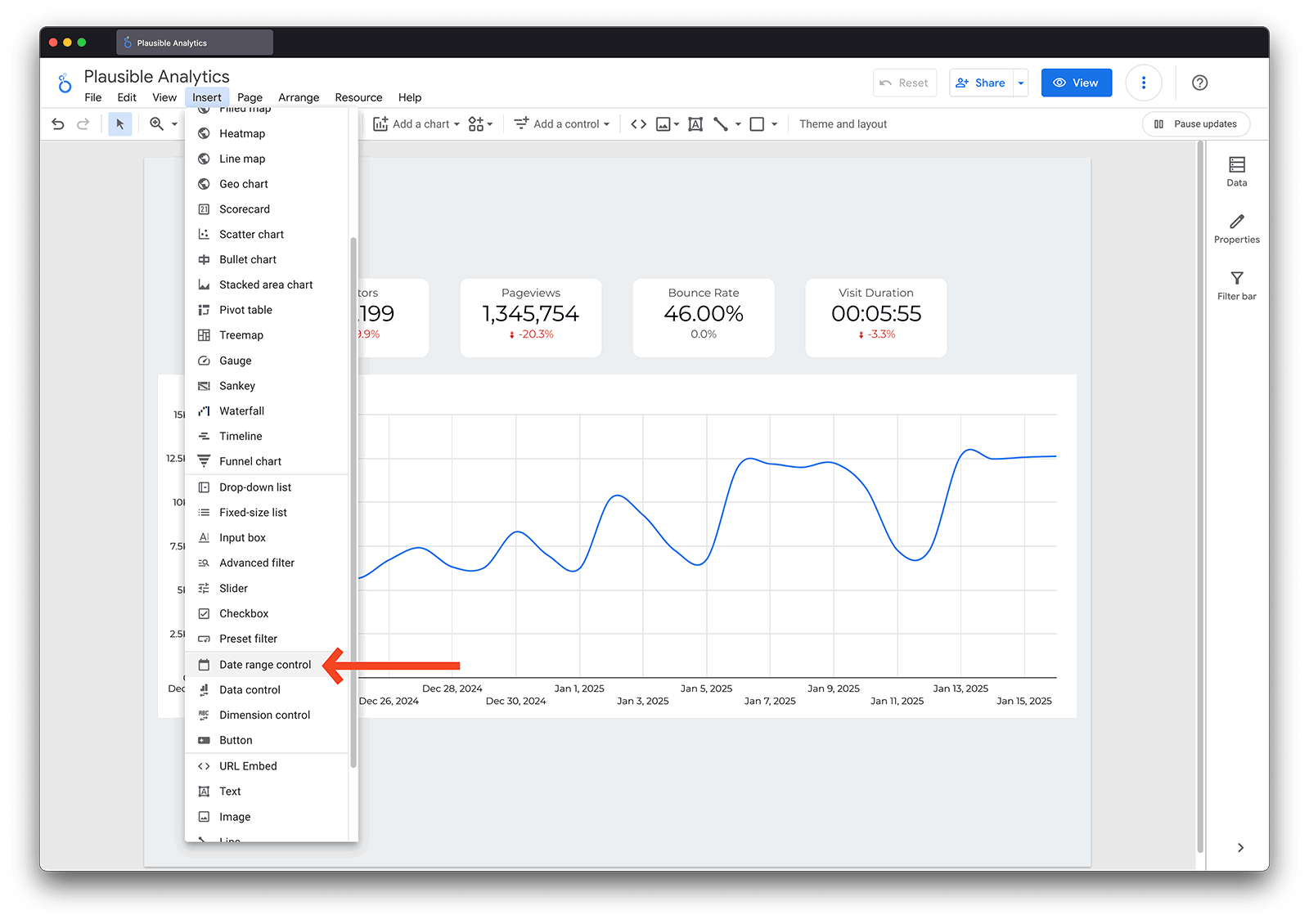
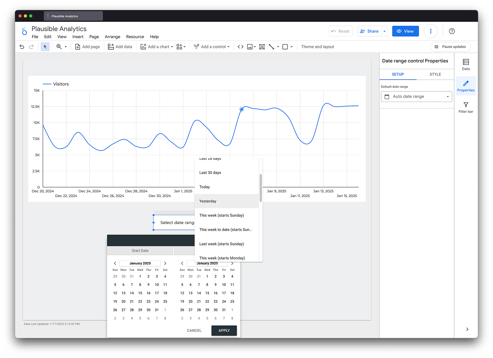
Speaking of date ranges, this is a good time to add one to our report. To do this, you simply go to “Insert”, choose “Date Range Control” and click anywhere on your report.
This will give you a dropdown menu that enables you to select the date range you want to view for your entire report. When you change this date range, any comparisons that you’ve enabled (like our scorecard) will automatically update as well.
Tables
Then we can move down our Plausible Analytics dashboard and recreate some of the tables you will find there. Tables in Looker Studio are one of the most versatile ways you can use your data as you can add several dimensions at once and export to CSV or Google Sheets.
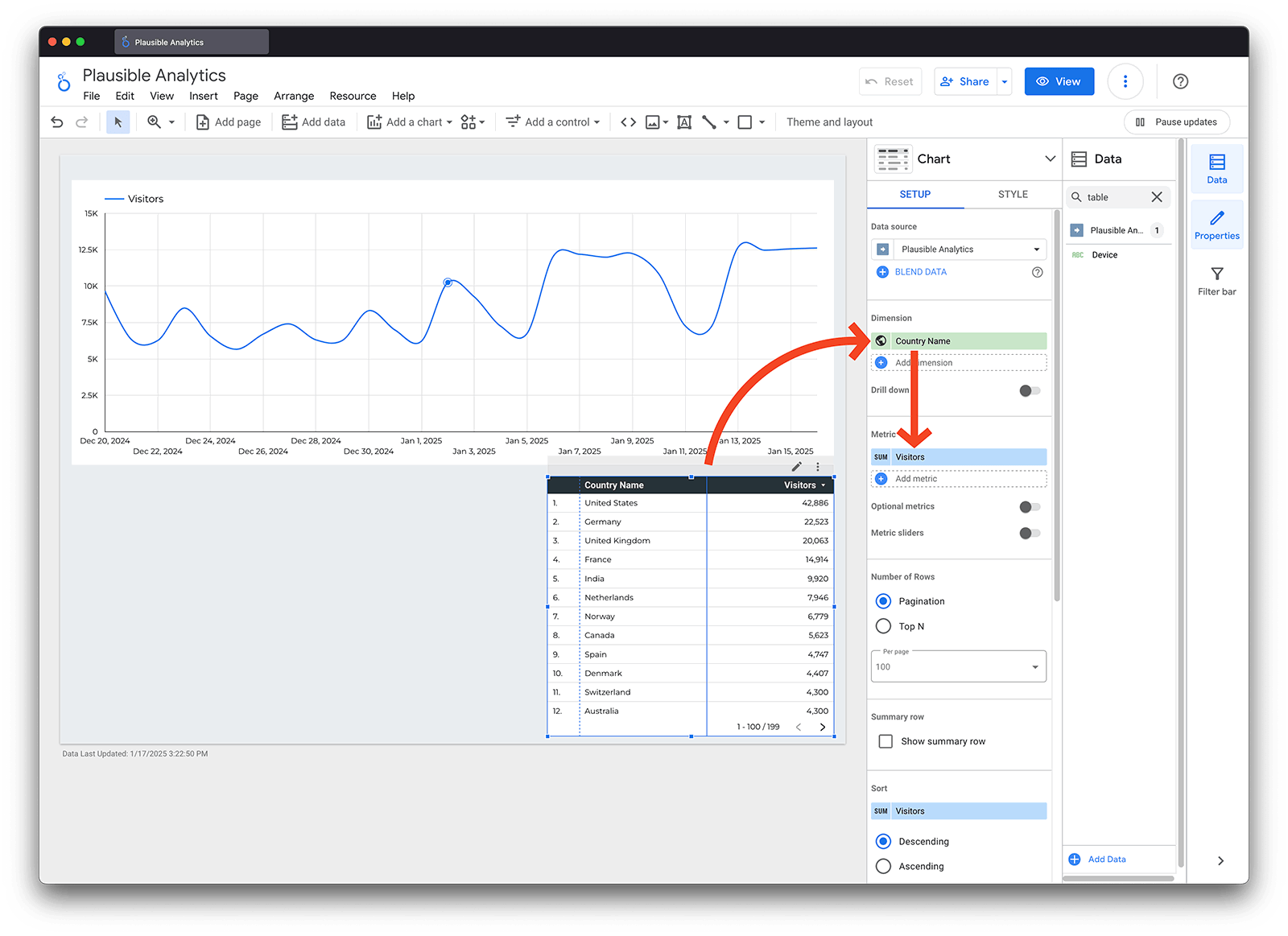
For our purposes, we will look at the “Countries” and “Devices” section of the Plausible dashboard as these particularly show the strength of Looker Studio. In order to recreate the list of countries, we simply need to select “Insert”, choose “Table” and then choose “Country Name as our “Dimension” and “Visitors” as our metric.
But then if we want to add “Region” and “City”, we can actually just add those directly to the same table by adding those as new dimensions.
So now we have a table that gives us the granular level detail of each country, region and city combination, something that you would have to click on each item individually in the Plausible dashboard.
You can see this as well with the “Devices” table. By selecting “Device”, “Browser” and “OS” as dimensions, you can see the stats for each individual combination.
Filters
Finally, let’s add some filters to our data. Looker Studio offers simple and advanced filtering and for now we’ll stick to the basics. To add a simple drop-down menu that will enable you to filter by different dimensions, you can go to “Insert” and choose “Dimension Control”.
Then you simply need to select what dimension you want the drop-down to use. For our example, let’s add one that corresponds to the Plausible dashboard: “Source”.
Once you add this, you will see that if you click it, you will see all the sources that referred traffic to your site. By selecting one or many, we will filter our report accordingly.
Considerations
Creating your own customized reports gives you the power to use your Plausible Analytics data in new and interesting ways but it also means that you will be exposed to some of the limitations of how different data fields can or cannot be combined.
One of the primary considerations to keep in mind is that some dimensions are based on events (every action that takes place on your site) while others are based on visits (sessions that take place on your site). Depending on which category a dimension falls into, different metrics will be available. In general, page, hostname and goal are event dimensions while all others are session dimensions.
Bounce rate, visits and visit duration can only be used in combination with session dimensions, while events can only be used with event dimensions. In the case that you use an invalid combination of dimensions and metrics, you will either see null values for the invalid metric or you will see an error in Looker Studio.
For example, if you try to use entry page as a dimension together with events, you will see null values because entry page is a session dimension. (it keeps track of the first page that a user visited during their session)
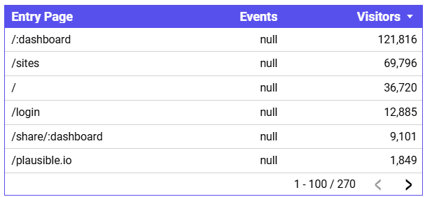
You have several ways that you can work around this. First, you can use visitors or visits as a metric with session dimensions like entry page. Second, you can use page (which is an event dimension) with the events metric. And finally, you can use entry page in a filter and then pick an event dimension for your table like goal name. This way, you can see event-level details for a list of goals corresponding to the landing pages that you specify via the filter.
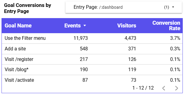
In general, filter dimensions do not have the same limitations as dimensions that you add directly to your charts and tables, so this can be a good alternative in many cases.
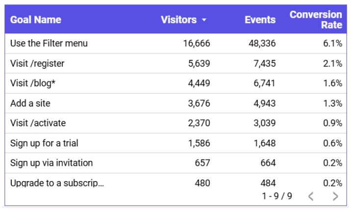
Another consideration is that goals and custom properties have an additional conversion rate metric that can only be used when one of these fields is either added as a dimension or used in a filter. In order to get the number of unique conversions, you should use the visitors metric and in order to get total conversions you should use the events metric.
So to create the table in the Plausible dashboard that shows unique conversions, total conversions and conversion rate by goal, you would have a table that looks like this in Looker Studio.
If you have revenue goals set up for your site, you will also be able to use the “Total Revenue” and “Average Revenue” metrics. These metrics work in a similar way to Conversion Rate, in that they require Goals or Custom Props to be added either as a Dimension or a Filter.
The value of the revenue goals will be displayed as a simple number and you’ll need to apply currency formatting inside Looker Studio by clicking the edit icon, then going to Data Type → Currency and selecting the appropriate currency.
Any Goals that have not been set up as revenue goals will display as Null. If you would like to create a Scorecard metric that shows total revenue for your entire site, apply a Filter using the Goal Dimension. The easiest way to do this is to create an ‘In List’ filter so you can select which Goals to include (either all Goals or only those tied to revenue).
Advanced uses of Looker Studio
Plausible Analytics Looker Studio connector proves even more useful when you are using it for advanced applications that cannot be replicated in the Plausible dashboard.
Here we will cover a few examples of different advanced uses. You can also see our advanced Looker Studio template.
Combining elements
One of the effects that is featured in the advanced dashboard is to have a scorecard that has a chart line background giving you the ability to quickly grasp the trend of the metric you are displaying.
You can accomplish this effect by layering two Looker Studio components one on top of the other. In this case, we have a “Timeseries Chart” and a “Scorecard”, with both using the same metric: “Visitors”.
In Looker Studio, you can control the order that objects are displayed by right-clicking on an element and selecting “Order”. You will then have the option to send an element up or down relative to other elements in your report.
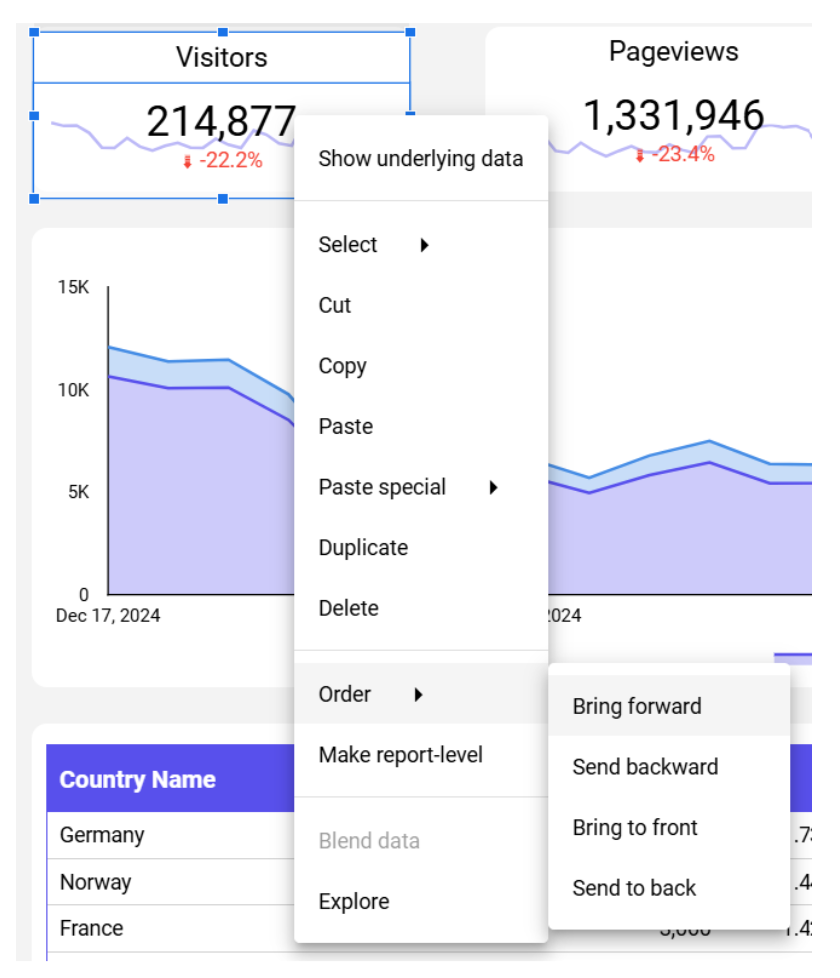
In our case, we have set our scorecard to be the same height and width as our chart but we have then set the order of the chart so it is below the scorecard. Finally, we just need to set the background color of the scorecard so it is transparent enough for the chart to show through. You can do this by going to “Style” and choose “Background and Border” and choose “Background.”
Custom groups
The next element on the advanced dashboard is a stacked line chart that uses a custom grouping of data to show the split of direct vs. non-direct traffic.
To achieve this breakdown we will be using the “Stacked Area Chart” visualization and we will be selecting “Date” as the dimension and “Visitors” as the metric. Then under “Breakdown Dimension”, we will need to select “Add Metric” and choose “Add Group”.
This will open up a screen where you can configure a new custom “Data Group”. In our example, we want to use the dimension “Channel”. By default, this field will indicate what channel a visitor used to visit the website including direct as well as organic search, email, organic social and others. We can configure our own groups that are direct and non-direct, by specifying that the direct group should exactly match the value direct while anything that doesn’t match will be grouped as non-direct.
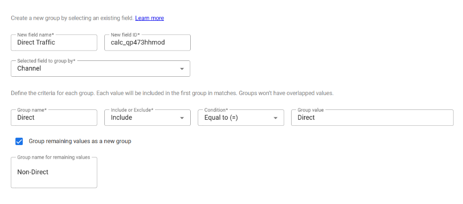
Once we have done that, we can now use our direct traffic group in our chart as our breakdown dimension.
Calculated field
One element that we didn’t fully recreate in the basic Looker Studio dashboard that is present in the Plausible dashboard is the table that shows the percentage breakdown of traffic by country. Previously, for simplicity, we stopped at total numbers of visitors without showing the percentage.
The reason for this omission is that displaying the percentages requires that we use a calculated field. To do this, we click on our table and go to “Setup” and under “Metric”, we can select “Add Metric” and choose “Add Calculated Field”.
This opens up a screen where you can create your own custom calculated fields based on the data that is already available in the report. In our case, we want to create a new metric called “%” that simply returns the visitors metric in a new format.
We will select “Percent” under “Data Type” and “Percent of total” under “Comparison calculation”. This tells Looker Studio that we want our new metric to calculate the percentage of the total for each row in our table.
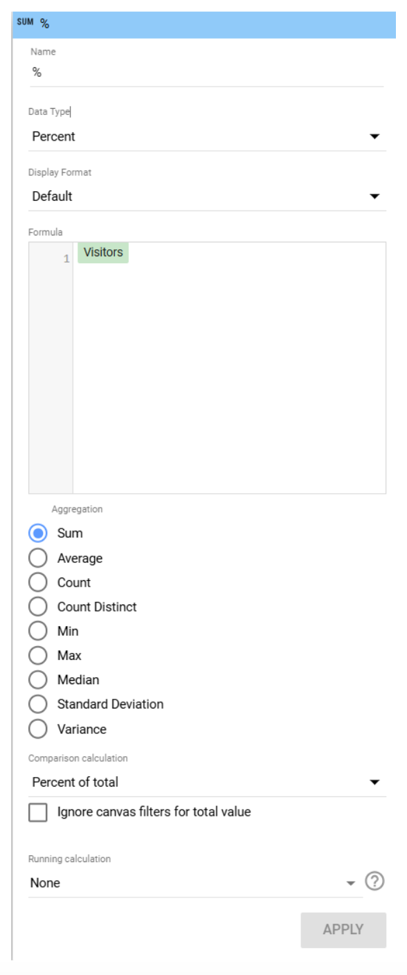
Once configured, we can now see the percentages in our country / regions / cities table.
Advanced filters
Previously, we looked at simple Looker Studio filters that can be accomplished by adding drop-downs to the report. Looker Studio also allows for more advanced filtering that can be done at the level of individual elements.
To demonstrate, we will build a stacked bar chart that shows two specific goals over time: ‘visit /register’ and ‘Sign up for a trial’. This would be a useful view to look at to track the performance of a specific register page over time in terms of sign ups. Note that these two specific goals are related to our own Plausible dashboard and you’ll need to use goals that you’ve set up on your site.
To start off, we will insert a “Stacked Column Chart” and we will select the “Date” as the dimension, “Goal Name” as the breakdown dimension and “Visitors” as the metric. Remember that when dealing with goals, the visitors metric gives the number of unique conversions.
But now we have a chart that has all of our goals rather than the two that we are interested in so we need to add a specific filter to the chart. We can do this by going to “Chart”, select “Setup”, then “Filter” and finally “Add a Filter”.
This brings up a screen that enables us to configure our advanced filter. We will select “Goal Name” as our dimension and we will select “Include” as we are selecting the conditions to include data. Exclude can be used if we wanted to filter out these two goals instead. Then we will select “In” which enables us to list the goal names that we want to filter for.

For other situations, Looker Studio offers the ability to check for equals, contains, starts with as well as Regex matching.
Data blending
Now that we have a chart that shows the performance of our goals over time we might want to calculate the % relationship of one goal to the other to see what percentage of visitors completes this stage of our conversion funnel. In our example case, we might want to know the conversion rate by day of our registration page, in other words, what is the number of sign-ups divided by the number of visits to the register page.
You might think that we could simply create a calculated metric like before where we take a percentage of the total but unfortunately in this case Looker Studio will give you the percentage out of all of the goal conversions rather than just the two goals that we want to see.
As a result, we need to blend our data in Looker Studio. This enables you to create custom data views by joining data together based on fields, filters and join conditions that you specify.
Let’s look at how it works in more detail. First, you go to “Resource”, select “Manage blends” and click on “Add a blend”. Then we need to configure the blend based on the fields that we are interested in and specify how we want to join the data together which in our case will look like this.
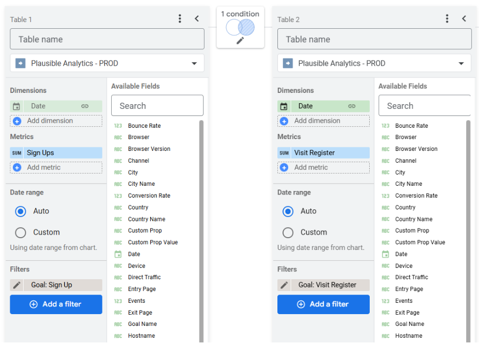
In the left table we want date for dimensions and visitors as the metric. Then we need to add a filter that matches goal name equal to “Signs up for a trial”. This will be the numerator for our calculation as it will give us visitors that signed up for a trial by date.
Now we need to configure the right table to give us our denominator. For this we will configure everything the same except we will change our filter to equal “visit /register”. This way we will now have our visitors that visited the register page.
It is helpful to rename the metrics on each side so you don’t mix them up. We will call the left-hand metric “Sign Ups” and the right-hand metric “Visit Register”.
Finally we need to configure the join condition. We will select “Right Outer” and we will join on date which means that there might be some dates that have “visit /register” but no conversions and these days should still be included.
Now that we have our data blend ready, we just need to select this blend as the data source for a table. Then we can select date as our dimension and “Sign Ups” and “Visit Register” as our metrics. Finally, we can create a calculated metric that divides sign ups by visit register.
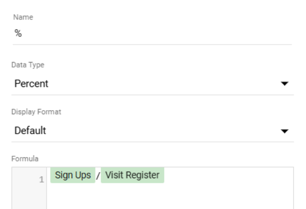
With that calculated field, we now have our table that shows the conversions by date as well as the conversion rate for that specific step in our customer journey.
Advanced formatting
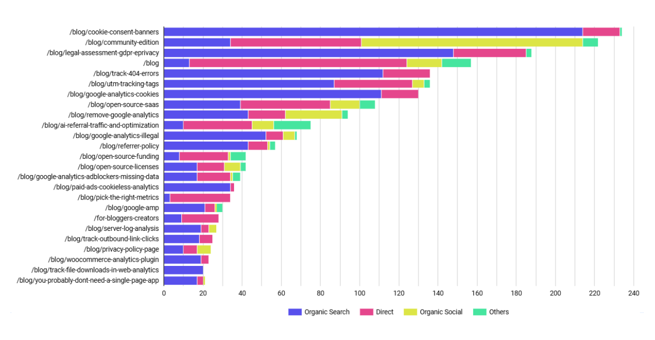
Finally let’s see some more advanced ways you can format elements in Looker Studio by looking at the bottom section of the advanced template. First, we’ve created a horizontal bar chart that shows the channel breakdown of visitors to different entry pages on our blog.
To create this, we’ve simply set “Entry Page” as our dimension, “Channel” as our breakdown dimension and “Visitors” as our metric. Then we’ve added a filter for “Entry Page” contains “blog.
This gives us an interesting but unwieldy chart with too many rows and colors to properly comprehend. In order to make the chart more useful we can do two things. First, we will limit the number of rows to 25 by going to “Chart”, select “Style” and setting “Bars” to 25.
Then we will go to “Chart”, choose “Styles”, then “Series”, set the number to 4 and check “Group Others”. This means that the number of channels shown as stacked bars will be capped at 3 and all the others will be grouped into a fourth other category.
With these style settings, we’ve now created a concise chart that gives us a quick view of our top 25 blog posts and where the main sources of traffic are coming from.
Finally underneath this chart we have a table that is set up to conditionally format a row based on whether or not it makes up 80% of the blog traffic. This way we could do an 80 / 20 analysis and see which blog posts are the most important in terms of driving new traffic.
To do this, we create a table with entry page as the dimension and visitors as the metric. Then we need to create a calculated metric that keeps a running total of the visitors percentage. We can do this by selecting “Percent of Total Relative to Corresponding Data” under “Comparison Calculation” and “Running Sum” under “Running Calculation”.
Then we just need to use this to style our table by going to “Chart”, then “Styles”, “Conditional Formatting” and finally “Add. This will bring up a screen that will allow us to configure our “Conditional Formatting Rule”.
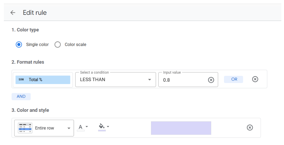
Here we will select our total % calculated field and specify that anything “Less Than” 0.8 should be highlighted. With this, we will have a nicely highlighted table with all blog posts that make up the top 80% of traffic highlighted.

Try it for yourself
Plausible replaces Google Analytics with a simpler, privacy-first dashboard. No cookies, no personal data, no consent banner. The official Looker Studio connector adds custom reporting on top of that, so you get both: clean data collection and the flexibility to present it however you need.
If you haven’t tried Plausible yet, start a free 30-day trial. No credit card required.